TL;DR
The gap performance metrics miss
People send money, book doctors, renew licenses, and leave the screen unsure of what just happened. The standard explanation is cognitive overload. But the user who finishes without errors and still cannot say whether the money has left the account was not overloaded. They were not informed.
This is a live international experiment that makes that gap visible. I designed the construct (cognitive distance), operationalised it into four dimensions, pre-registered five hypotheses, and shipped the platform collecting data today. The conceptual paper is under peer review.
The result is a research instrument for questions performance metrics have ignored for thirty years, and a demonstration of taking a construct from theory to instrument to data.
01. The reframe
Load measures effort. Distance measures understanding.
Cognitive load theory (Sweller, 1988) gave HCI a vocabulary for capacity: working memory is finite, and tasks that exceed it fail. Decades of design advice followed . simplify, reduce, declutter.
Yet the most consequential usability failures persist in systems that have already lowered load. A user completes a transfer in three taps, sees the confirmation, and still cannot say whether the money has left. The interface was not too heavy. It was too opaque; the user executed system logic they could not parse.
That is the difference this study operationalises. Cognitive load measures how much effort a task demands. Cognitive distance measures whether the user can explain, predict, and transfer the system's logic into their own reasoning. Load is about capacity. Distance is about alignment.
Two phenomena, two different problems
Cognitive load measures effort. Cognitive distance measures alignment.
The traditional frame
Cognitive Load
the working memory cost of acting
- AsksHow much effort does this task demand?
- MeasuresMental resources consumed per task
- Unit of analysisThe single interaction
- InadequacyA simple task can still be misunderstood
The reframing
Cognitive Distance
the gap between system logic and user model
- AsksCan the user explain, predict, and transfer?
- MeasuresAlignment between system and mental model
- Unit of analysisThe relationship, over time
- CapturesSuccess without comprehension. The blind spot.
02. Why it matters
Completion rate hides comprehension failure
Usability research relies on time-on-task, completion rate, and error frequency. ISO 9241-11 codified them; Nielsen operationalised them; most product teams use them weekly. They are robust, and none of them answers: did the user understand what just happened?
A high completion rate can sit on widespread misunderstanding. A low error rate can co-exist with users who cannot say whether their task succeeded. The proxies register success while interpretation collapses.
The cost falls hardest on users with the least interpretive surplus: people with cognitive disabilities, neurodivergent users, older adults, anyone working under time pressure or in a second language. For them, opacity translates directly into exclusion, dependence, and repeated error.
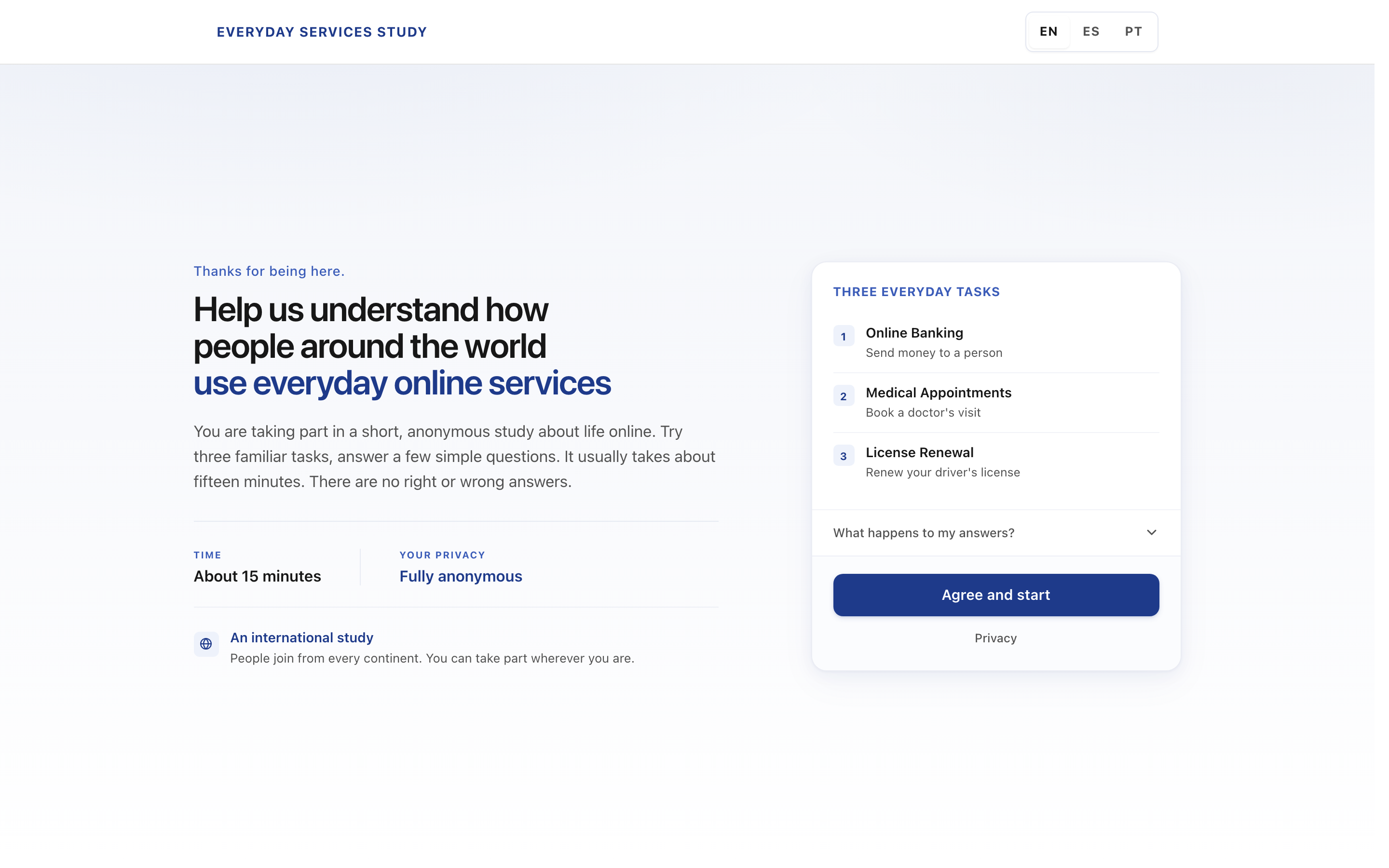
The study's production welcome screen, in English.
eConsent visual language: elevated session card, three-line headline, sticky agree button. Reads as international research, not consumer marketing.
03. The framework
Four dimensions that make distance measurable
Moving cognitive distance from slogan to construct requires treating it as a multidimensional variable. Four observable dimensions, drawn from cognitive ergonomics and HCI; triangulate the construct. Each is independently measurable. Together they form a Cognitive Distance Index (CDI) portable across studies, product lines, and design reviews.
Operational framework
Four dimensions, one construct
Each dimension is observable; together they triangulate cognitive distance.
01
Perceived Understanding
Can users explain what happened in their own words?
Self-assessed clarity. The felt sense of having a model.
02
Predictive Accuracy
Can users anticipate outcomes before acting?
Recurrent surprise is a sign of misalignment, not surprise itself.
03
Interaction Confidence
Do users decide without recurrent hesitation?
Stable decisions indicate an internalised model. Fragile ones don't.
04
Conceptual Transparency
Does the system make its causal links visible?
The interface's burden, not the user's, not the model's.
Method-agnostic: surveys, prediction tasks, behavioural coding, retrospective explanation.
Load and distance can dissociate
A task can be demanding and still transparent; effortless and still opaque. The quadrant below maps those four combinations. The study's central prediction is that Version B (institutional register) shifts participants into the high-load, high-distance quadrant, without changing the behavioural completion rate.
Analytical dissociation
Four logically possible combinations
Demanding, transparent
Q2
Demanding, opaque
Study's central observation
Brief, predictable
Q1
Easy, inexplicable
Q4
From score to action: four diagnostic bands
The CDI is diagnostic, not comparative. Each band carries a recommended response: Preferred (maintain), Watch, Action needed, and Critical (governance-level redesign).
Cognitive Distance Index, Interpretation
Four bands, four design actions
A diagnostic protocol, not a single comparable score. Bands travel with a recommended response.
01, Preferred
Conceptual alignment is strong.
Users can predict, explain, transfer. Maintain and monitor for drift.
Lower CDI
02, Watch
Early signs of misunderstanding.
Confined to specific tasks or groups. Refine labels, feedback, and guidance.
03, Action needed
Misunderstanding is repeated.
Affects usability and accessibility. Prioritise redesign and validate iteratively.
04, Critical
Misalignment is severe.
Disrupts interaction. Launch governance-level redesign and remediation.
Higher CDI
04. Study design
One variable, two arms, three domains, five hypotheses
The design is deliberately austere. Interface language register is the only variable that moves. Every click, every field, every outcome stays identical. If the arms diverge on completion time or effort, the manipulation failed, and manipulation checks guard exactly that.
Study architecture
One variable. Two arms. Three domains. Five hypotheses.
Participant → Balanced assignment
Silent variant assignment (least-used arm) + balanced module-order rotation.
Arm A, Plain language
Explains what, why, and what next.
Same clicks, same fields, same outcomes as Arm B.
Arm B, Institutional register
Bureaucratic labels, no explanations.
Same clicks, same fields, same outcomes as Arm A.
Module 01
Banking
Transfer to a new recipient
Module 02
Medical
Book a specialist appointment
Module 03
License
Renew with prefilled data
Per-module measurement
Prediction MCQs
Comprehension MCQs
Confidence
Open explanation
Post-task scales
Between-subjects, not within. Each participant sees one register across all three modules. Once someone decodes an institutional phrase, they carry that decoding forward; between subjects is the only design that keeps the register stable.
Balanced, not random. Silent server-side assignment picks whichever arm has fewer starters (ties break randomly). Module order is balanced across six rotations of [banking, medical, license]. Device-local duplicate detection prevents re-entry.
Three domains, one protocol. Online banking (transfer), medical appointments (specialist booking), and driver license renewal (pay, review, mail). Each module follows the same arc: task intro, prototype flow, prediction MCQs, result screen, comprehension MCQs, post-task scales.
Hypotheses
Five primary, four manipulation checks
All pre-registered as directional. Checks guard against confounds: if the flows themselves feel different, the manipulation failed its isolation test.
Primary hypotheses, Per-module
H1
Perceived understanding
Self-reported clarity, 1 to 7
Plain > Institutional
H2
Open explanation accuracy
Blind rubric, 0/1/2 per fact
Plain > Institutional
H3
Prediction accuracy
MCQs before result
Plain > Institutional
H4
Confidence calibration
Confidence × correctness
Plain better calibrated
H5
Task-done certainty
Single-item, post-task
Plain > Institutional
| ID | Hypothesis | Measure | Direction |
|---|---|---|---|
| H1 | Perceived understanding | Self-reported clarity, 1 to 7 | Plain > Institutional |
| H2 | Open explanation accuracy | Blind rubric, 0/1/2 per fact | Plain > Institutional |
| H3 | Prediction accuracy | MCQs before result | Plain > Institutional |
| H4 | Confidence calibration | Confidence × correctness | Plain better calibrated |
| H5 | Task-done certainty | Single-item, post-task | Plain > Institutional |
Manipulation checks
Must not differ.
If the two arms feel different on these, the manipulation failed.
- Ease (1 to 7)
- Effort (1 to 7)
- Completion time
- Three agree-items
Direction pre-registered. Inferential tests run on exported CSV. Descriptive comparisons ship in-product.
Manipulation checks guard isolation. If the arms diverge on ease, effort, or completion time, something other than language moved. The platform flags this in real time on the researcher panel. Failed checks trigger sensitivity analysis.
Version A, Plain language
Explains what each step does, why information is needed, and what happens after submission. Result screens name the next actor and timeline in everyday terms. Same steps and final state as Version B.
Version B, Institutional register
Same flows and outcomes. Labels mirror bureaucratic systems ("Operation processed", "Pending allocation"); explanatory panels removed; result copy assumes institutional literacy. No extra clicks; only words change.
05. Platform engineering
Built for real participants on real devices
A good research design means nothing without a platform participants trust, on the devices they use, in the languages they read. Building it end-to-end; front-end, back-end, deployment, researcher panel, walkthrough mode . was the bulk of the work. Six decisions mattered most.
One click consent, GDPR / LGPD aligned
No localStorage before consent. No cookies. No tracking pixels. A compact summary line, a collapsible disclosure, and a single 'Agree and start' backed by `consented_at` and `consent_version` on the participant row. End-of-study data choice: keep or delete, one click each.
Silent balanced assignment
A server-side route reads current `module_runs` counts, picks the least-used arm and the least-used module order, and writes `variant` + `order` atomically. Participants never see the assignment. The field never sees a 60/40 imbalance.
Mobile first from 320px to 1440px
Every phase audited on iPhone SE, iPhone 14 Pro, iPad, and desktop. Bottom sheet on mobile (up to 55vh) and a 420px dock on desktop, so the background never reflows when questions open. WCAG 2.2 AA: fieldset/legend, 44px targets, focus management, `aria-live` progress.
Three locales, one manipulation system
EN, ES, and PT-BR. Locale detection happens pre-consent (in memory only); persistence starts after agreement. Shell copy is identical across arms; only manipulation copy differs. A mistranslated button cannot become a hidden variable.
Transparent panel analytics
Researcher panel with H1 to H5, manipulation checks, and drill-downs to participant rows. Portfolio links open in read only demo mode at panel.everydayservices.study/demo.
Documented design system + walkthrough mode
About 35 documented components cover the experiment funnel: welcome, steppers, question dock, finding cards. Walkthrough mode replays all six module/variant combinations without interaction, for training and IRB walkthroughs.
06. Methodological rigor
Built to be replicated, not admired
Another researcher could rebuild the protocol from public documentation alone. Module rules live in plain Markdown (RULES-BANKING, RULES-MEDICAL, RULES-LICENSE). Business rules, Version A/B result copy, and scoring keys for every question are versioned alongside the code.
Anonymisation is aggressive by design. No name, email, IP address, device identifier, or full user-agent in the research dataset. No participant cookies. The researcher panel uses an httpOnly session cookie scoped to staff. This shaped the consent flow, welcome copy, assignment route, and deletion API, not a compliance afterthought.
Participant flow
The fifteen-minute funnel
Step 01
Welcome
Layered, one-click
Step 02
Demographics
5 questions
Step 03
Assignment
Silent, balanced, server-side
Step 04
Module 1
~5 min per module
Step 05
Module 2 to 3
~5 min per module
Inside each module
07. Diagnostic concept
Externalized processing: the pattern behind the problem
The construct points at a recurring design pattern that produces cognitive distance. The conceptual paper introduces externalized processing: systems that specify valid input conditions without providing internal means to meet them. Format restrictions, size limits, naming rules; each becomes a user-side preprocessing task with an interpretive burden on top.
The diagram below contrasts the pattern that pushes work outward (letting interpretation collapse) with the pattern that keeps it in-system (keeping the causal chain legible). Every module embeds a version of this trade-off, which the comprehension and prediction questions are designed to detect.
Diagnostic concept
Externalized processing
The recurring pattern: systems specify constraints, users absorb the transformation.
Pattern A
User-side preprocessing
constraint without accommodation
- System states constraintsformat, size, naming, structure
- User searches, converts, compressesacross external tools and trial-and-error
- Completion depends on rulesthat may remain only partly understood
Operational work and interpretive burden move outward to users.
Pattern B
System-side accommodation
feasible transformation retained in-system
- User submits available inputthrough the primary interface
- System validates and, when feasible,normalises or transforms internally
- System returns clear guidanceor completes submission directly
Computational work stays with the system and causal relations become legible.
08. In the interface
Production screens from the live study
The platform reads as a calm research instrument, not a survey app, not a marketing flow. The question dock keeps results visible while participants answer. Result screens name the next actor and timeline in plain language (Version A) or in the system's own voice (Version B).
The full welcome screen at desktop scale.
Elevated session card, three-line headline, trust strip, sticky agree button. The desktop split layout earns its place here.
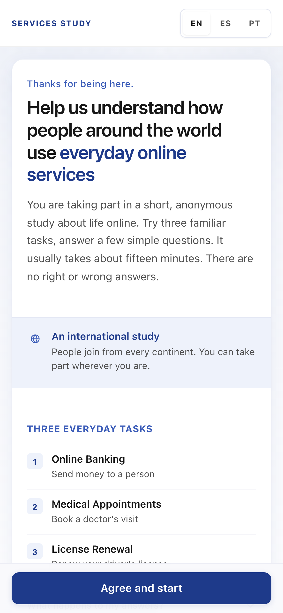
Mobile welcome, in English. Calm eConsent language, single elevated session card, sticky CTA.
Three-line headline with clamp() typography. Native disclosure for privacy summary; full notice one tap away.
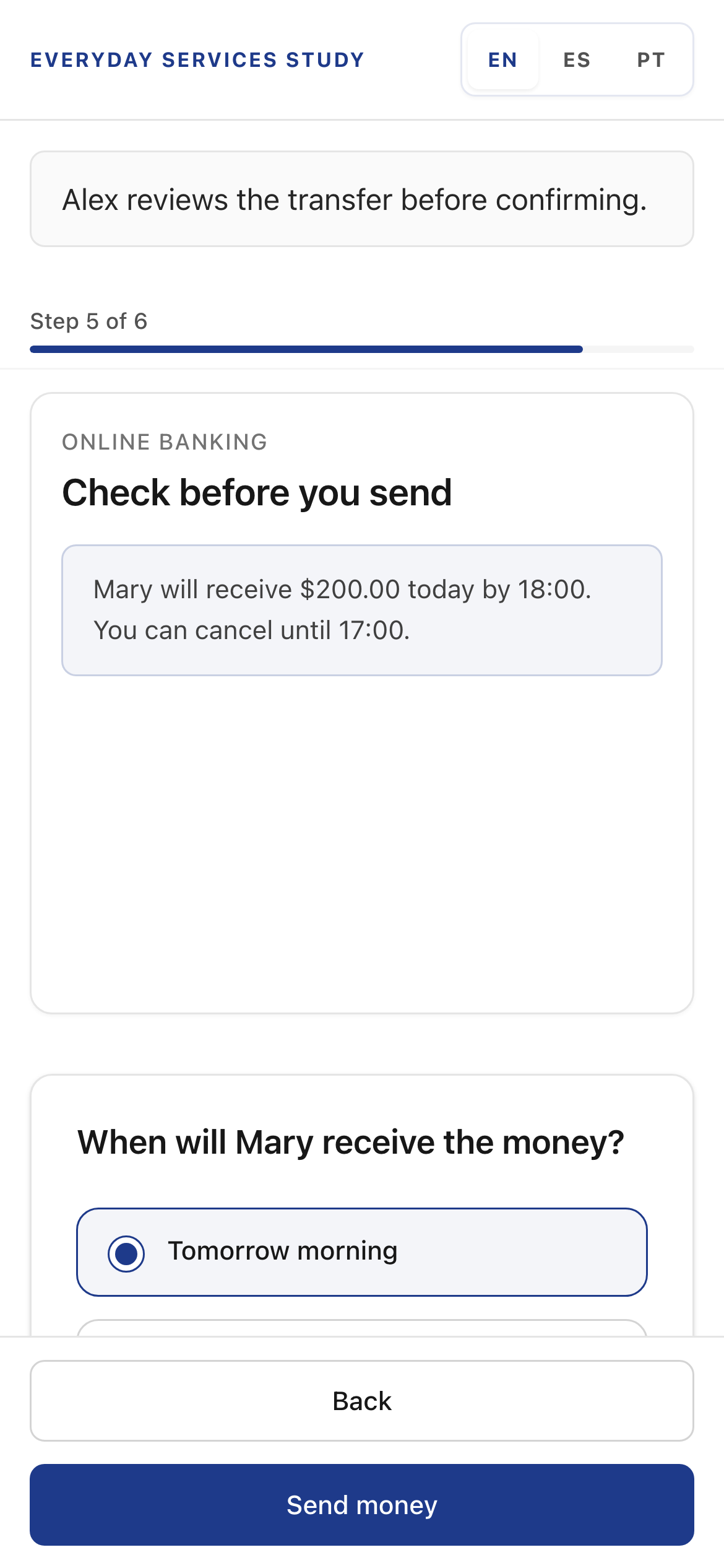
Prediction question on mobile at Step 5. The review screen stays visible while participants answer.
Bottom sheet up to 55vh, with the primary action fixed outside the scroll area. The background never reflows when the sheet opens.
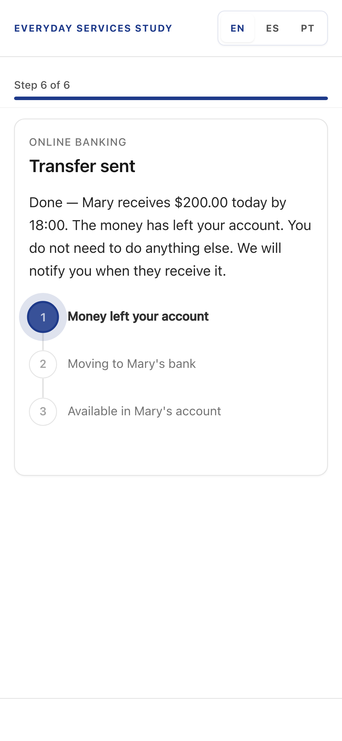
Banking result, Version A in English. Plain language next steps and a human status tracker.

Medical result, Version A. The screen names who will contact the patient and when.
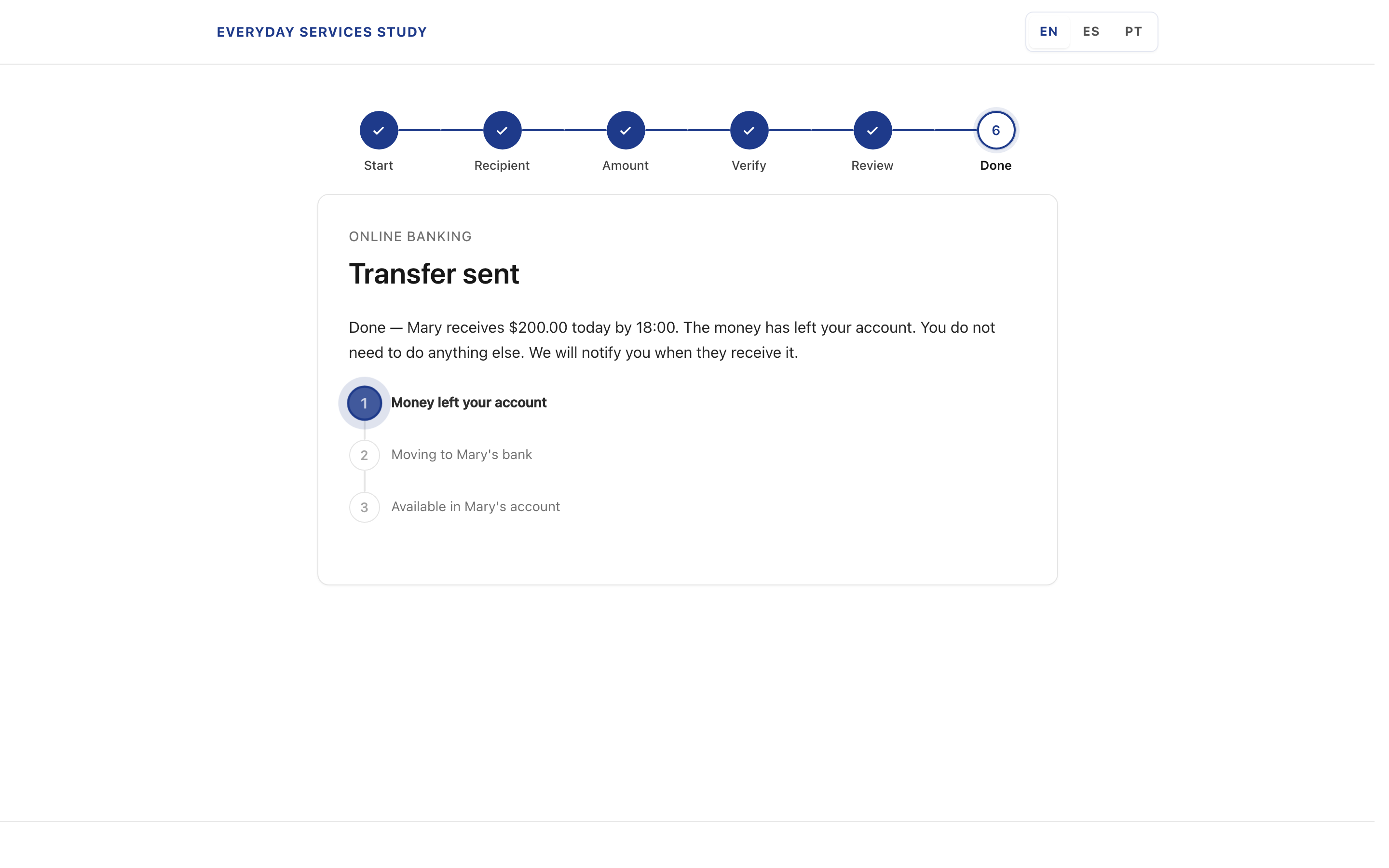
Desktop banking result. The vertical sub-stepper tracks payment lifecycle without leaving the service context.
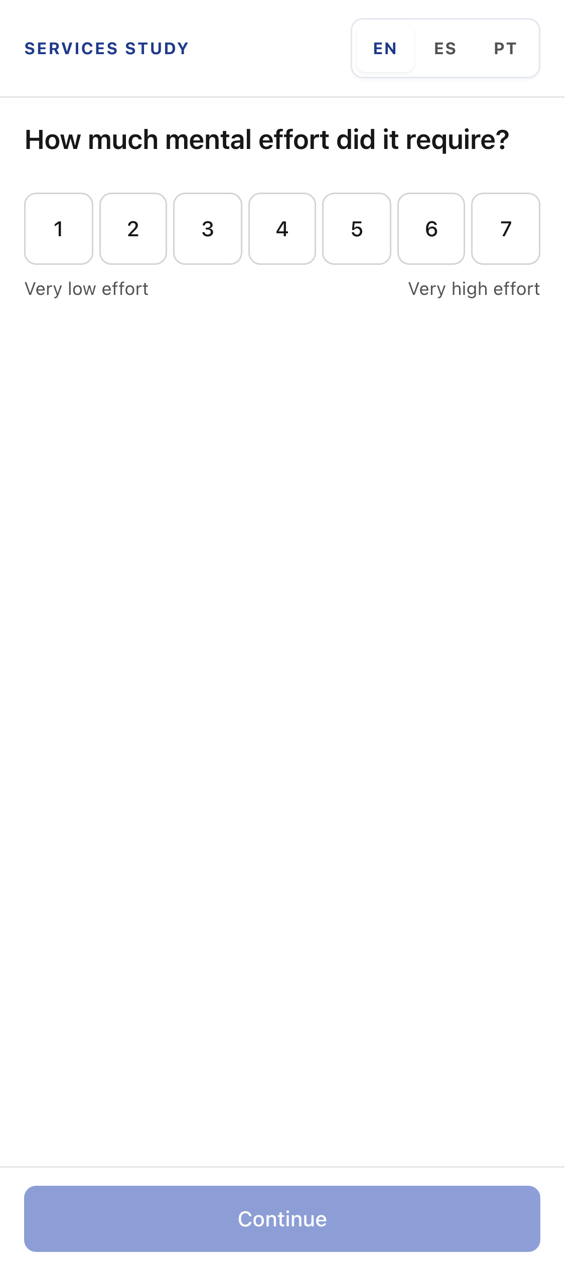
Post-task scales. Ease, effort, understanding, and task-done certainty, captured after each module.
These scales are the manipulation checks. The 1 to 7 effort scale shown here is one of four post-module measures. If A and B differ on them, the manipulation failed and the data is flagged for sensitivity analysis.
09. Early signals
Directional observations from active data collection
Data collection is active. The observations below are descriptive from early cohorts, directional, not headline findings. Inferential analysis follows manuscript submission. The panel surfaces every chart with that caveat inline.
Predicted most-uncertain service
Version A and Version B rank medical differently. Version B participants are more likely to flag license as the source of uncertainty.
Open explanations
Version A explanations name who, when, and what next. Version B explanations frequently stop at the system's surface phrasing, even when participants clearly understand the question.
Confidence calibration
Version A participants are more often correctly calibrated. Version B participants are more often over- or under-confident, a sign the mental model is unstable.
10. Pilot learnings
The construct separated. The first clear copy pass did not.
Before open recruitment, a friends and family pilot ran on vA1 clear language against vB institutional copy. Cognitive Distance Index separated the arms sharply: roughly 1 on clear language versus roughly 38 on institutional copy in the pilot sample. The manipulation did what the theory predicted.
Task time told a different story. vA1 clear language was slower than vB. For a study grounded in cognitive load theory, that is the wrong direction. I started over with vA2: static stepper, microcopy pass across banking, medical, and license flows, and archived vA1 strings so pilot rows stay comparable in the panel.
vB stays frozen as the control arm. New participants receive vA2. The prototype map lists every lane and walkthrough link in one place.
CDI ratio near 1:38
Strong separation between clear and institutional register in the pilot. Evidence the instrument detects language, not task difficulty alone.
Task time inversion
vA1 slower than vB on module completion. Triggered interaction and copy changes on vA2 without forking the codebase.
Versioning in place
Nine interactive routes and nine walkthrough routes from one repo, with prototype_version on each participant row for cohort filters.
11. Implications
What cognitive distance changes, if the data holds
If the hypotheses are supported, the study shifts what counts as a usability problem. Three implications travel with the construct.
- Accessibility moves from accommodation to prevention. Neurodivergent HCI research shows systems designed around neurotypical defaults impose invisible access work. Cognitive distance makes that work visible and measurable in design review.
- AI-mediated interaction becomes diagnosable. Automation, adaptive logic, and AI-generated outputs produce what Sarter, Woods, and Billings called "automation surprise", usable in the moment, opaque in rationale. CDI offers a mediating variable for trust, fairness, and reliance.
- Evaluation redefines what counts as evidence. Beyond whether users succeeded: can they explain the response, predict the next state, and identify the causal structure connecting action to outcome? That is the evidence base for inclusive, accountable design.
12. Stack
What runs the study
Next.js 16 (App Router), React 19, Tailwind CSS 4. Supabase (Postgres + Row Level Security) for participants, module_runs, events, answers, and open_scores. Vercel deployment with /api/health check. No PII in the research dataset; no participant cookies; httpOnly session cookie for researcher access only.
Production stack
- Application: Next.js 16, React 19 · TypeScript, Tailwind 4
- Data: Supabase Postgres, typed tables , Row Level Security
- Auth: httpOnly session cookie (researcher panel), anonymous key (participant funnel)
- Infra: Vercel, health check · environment-scoped secrets
- Documentation: rules in plain Markdown , design system, walkthrough mode
13. Read next
Related work and next steps
Outcome
From theory to live instrument, iterating on vA2
The platform is live on vA2, collecting data internationally. The conceptual paper is under peer review. The pilot proved cognitive distance separates arms. vA2 tests whether clearer copy can close the task time gap while holding that separation.
This case study documents the work of taking a construct from intuition to instrument: a research design that survives review, a platform participants trust, and a measurement practice honest enough to publish.
Most usability failures are not about effort. They are about explanation: systems that work procedurally and fail interpretively. This study makes those failures measurable.
Open data collection on vA2. Manuscript under peer review. Platform live and extensible to adjacent domains.